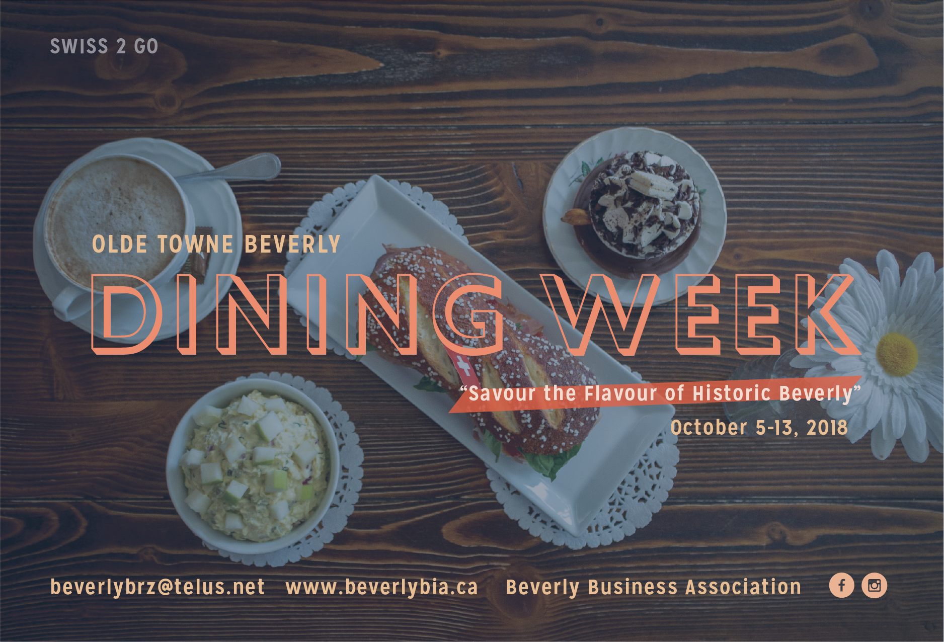
Brand creation and a full marketing campaign for Beverly Business Association to launch their new initiative “Beverly Dining Week”. The event is to increase patronage and awareness of what Beverly has to offer and remove the stigma that Beverly is a sleepy and forgotten neighbourhood of Edmonton.
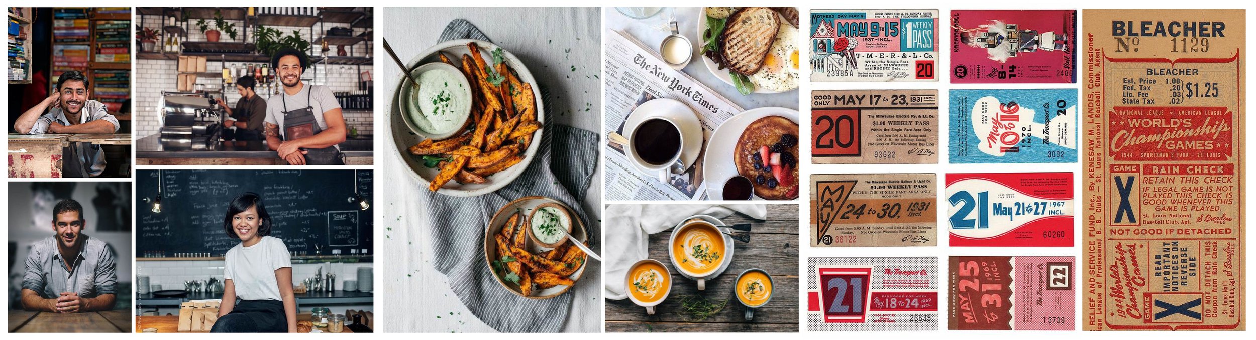
MOODBOARD
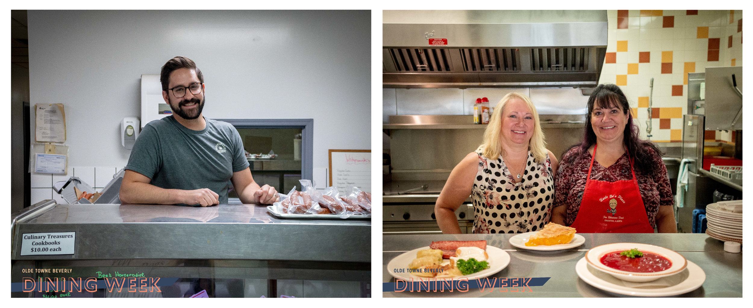
It was important to preserve the quaint small town feel of Beverly but in a way that makes it an enticing destination within Edmonton rather than a forgotten memory. The moodboard shows the theme of nostalgia while embracing a modern photographic approach to food and a rustic charm and approachability with the portraiture.
CAMPAIGN STRATEGY
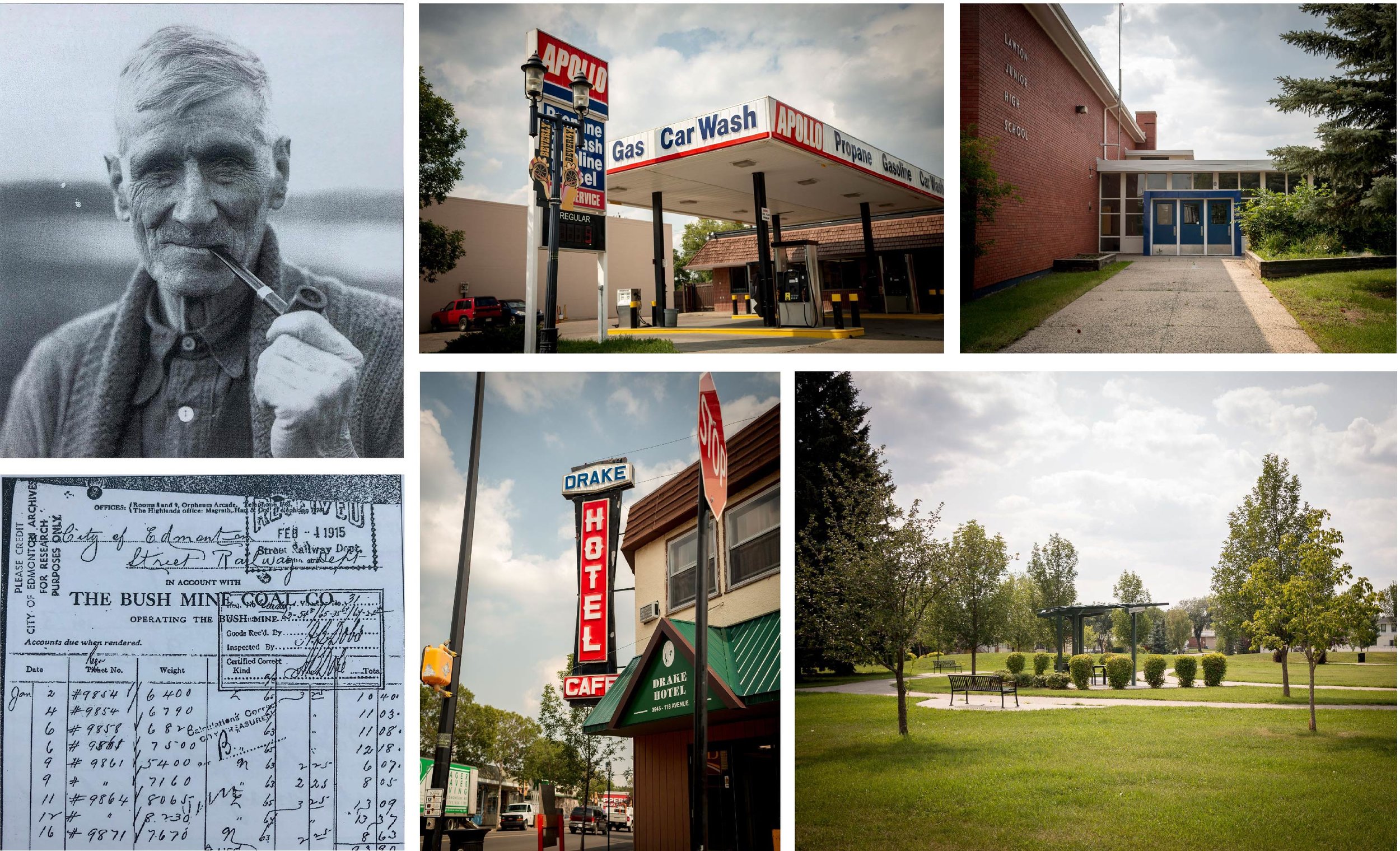
The campaign strategy was developed with our summer communications intern. Through research it was devised that the event would launch in four stages. Stage 1: History of Beverly from settlement to amalgamation to Edmonton. Stage 2: was the iconic places of beverly that have stuck around all these years and give Beverly it’s charm such as the old Drake Hotel. Stage 3: was introducing the event itself as well as the people who now run the businesses and make the community what it is, welcoming. Stage 4: was finally divulging the menus and spectacular food that would be available during dining week.
Art Direction: Lydia Stewart
Photography: Sushami Pomerleau-Piquette
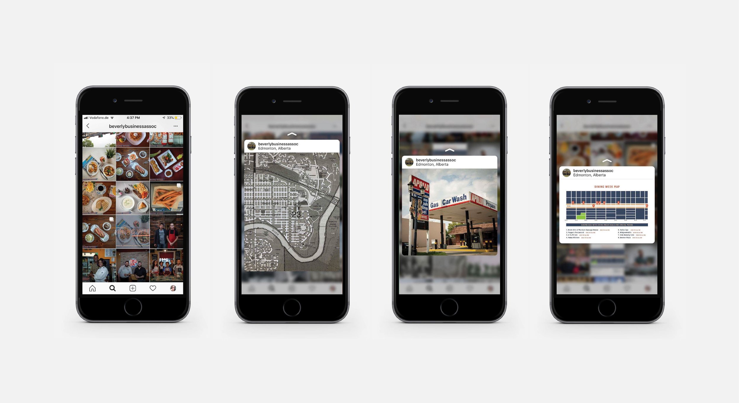
Marketing collateral was created months in advance for folks to get a tease of things to come and to note the dates of the event while the Wild Heart team could use that time to connect with all the businesses and organize the tour.
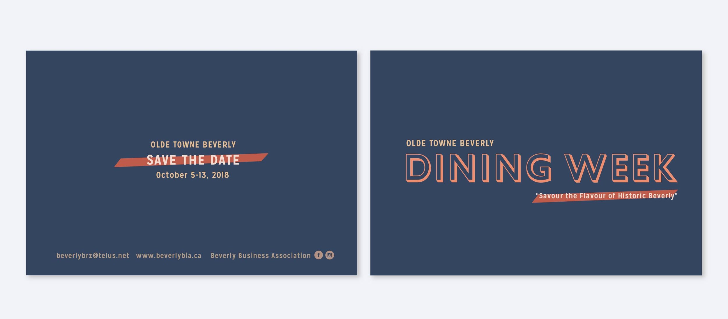
The branding is nostalgic without feeling old or stuffy. Images we took from visiting the establishments were used to entice people to come out and try the delicious things on offer. The over all tone was comforting and homey while still being motivational to get out and try something new.
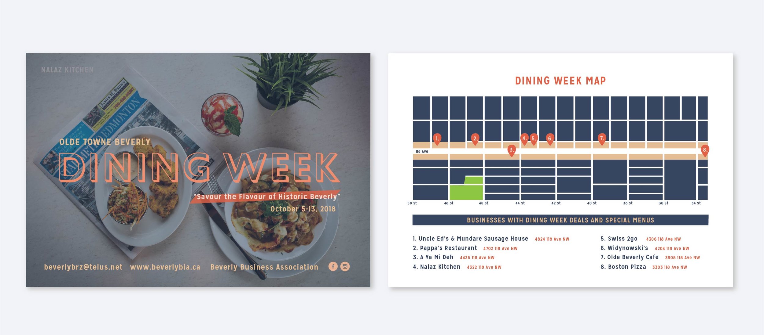
A map of the area was created to make it as easy as possible for people to visit. The beverly residents are an older demographic and though the intention was to bring new patrons to beverly, the residents are champions of their neighbourhood and love to support one another. The map postcard was a great tool for both residents and new patrons to find their way to each establishment.